About Art

Every time I meet someone interested in my artwork they ask if I have a website. Now I have a blog. Consider this the website. My goal is to sell original artwork to average people, which means at accessible prices. Most gallery original artwork is too expensive for me, so I figure it's too expensive for my peers. The truth of the matter is that painting in my living room does not cost that much, so I don't have to charge you that much. I hope the artwork on this blog inspires you to hang original art on your walls, be it as an investment or something to make you happy after a long day of work. Contact me at artwork.nicole@gmail.com to order.

Sunday, August 22, 2010

Inspirations

Yes, I've prepped some canvases. So I was not as idle last week as I was for the past two months! I have some good pieces planned, which I look forward to posting about, but in the meantime I have fodder for a few years worth of painting. I spent much of this summer traveling and spending time with family, and I came away with inspirations from images I saw and people I met.

When I travel I tend to visit galleries, and I like going places where the artists actually play a role in the gallery. The family-run Frykman Studio Gallery in Door County, WI is one, and the MPAF Artist's Coop in Monterey, CA is another (in which I have spent a lot of time and money over the past year, as I have attempted furnish my apartment while modeling my own business model on theirs). While wandering I've also run into art professors, a print maker and an oil painter my age.

Among all the people I met the most applicable conversation I had was with this painter, who had a tattoo of a Miro design on his forearm that looked to me like an airplane orbiting and lassoing the earth at the same time. I love Miro and all things Barcelona. But the point is that he was doing what I am in the process of beginning. He is specifically not selling - in fact he isn't even referring people to images of his art - because he is developing a solid body of work that is all going the direction he wants it to go. Once he has that repertoire he will presumably reenter the commercial art world. But he's my age and he's a good bartender and he loves to paint. I really enjoyed comparing notes with him.

I'm moving abroad in about a month, and I have some painting to do before I get there. But once I arrive I intend to do the same as he. I will no longer sell, but I will set up a studio and develop a strong body of work that is going the direction I want it to go. I will share it on this forum, but shipping is an issue so unless you come visit me I won't be selling. That said, I've been racking up images as fodder, and with my quasi-new digital camera I can share them with you! These will all be incorporated into the repertoire I develop, if only in experimenting with the play of light or the contour of a sea lion's skin. Please share your thoughts with me on how I can consider interpreting these images!

Door County


Sea Lion in Monterey


Ripples


Acadia
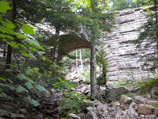


Lobster Boats


Rockland Sunset


Moules

Sunday, August 15, 2010

Summer Vacation

Ashley's Bouquet


Stats: 8x8x1.25 in. oil on canvas
Playlist: Brazil Soundtrack
Beverages: Evolution #9 (excellent Washington white blend)

I've been remiss. This summer I have been doing more traveling than painting, and while this has resulted in a distinct downturn in "production," I have netted a lot of nice inspiration. This summer has been busy, hectic and hot. May and June were filled with local social engagements, and one of the most memorable was my friends' wedding. They had a lovely ceremony, a very classy reception, and the best part of all of it was having the chance to celebrate such an important milestone among very good friends.

Having a somewhat fluid concept of the passage of time, I somehow ended up with one of the bridesmaids' bouquets, which had been left I believe at the bar we went to after the reception. I thought I would try drying it and then give it to the bride, but that failed miserably. Not one to pass up a good, free still life model, I painted it first. I have not decided what to do with this painting - I haven't been painting these still lifes randomly for self edification recently. However, given that the bouquet represents such a significant event celebrated among good friends that intend to remain close throughout our lives, I believe I will give it to the Maid of Honor so that she is never lonely and always reminded of her good friends. Fortunately she has a spotty internet connection, so I am not afraid of her reading this post before I give it to her.

July followed with trips to Wisconsin, California and Maine, and I came away with some excellent mental images that will stand me in good stead for the next six to 10 months as I search for inner inspiration. I will post on these separately, since I took many photos of light rippling in the water, etc., that I would like to share with you. Now it's August. The heat seems to have broken, and I have commissions to do!

As a fair warning, I will be taking orders through the end of this week. Your deadline is Friday, 20 August if you want me to do a painting for you. After that point I will be focusing on moving overseas and will change my art objective from producing art to sell to delving into my craft and amassing a good body of work.

Friday, June 4, 2010

Irises


Stats: 10x8x.75" oil on canvas
Playlist: Appalachian Spring, Aaron Copland
Beverage: Dark and stormy

It's funny. I had this open studio, and then I kept my own art up for my parents to see when they visited two weekends later, and a lot of people had the same comment. My floral still lifes are abstract. They're technically not - they're just painted quickly with liberal interpretation of shape. I like getting into the zone and painting what I see, but sometimes I'm not looking at the same image I started off with. I shift to the left or right. For example, in the tulips I painted in +/- I completely forgot to paint a blossom that would have been located in the upper left corner.

Those who know me will understand this as a common theme in my personal life. Oh yeah, the most basic life thing - usually washing the dishes - totally slipped my mind. I focus so much on other things I am passionate about that I sometimes miss the basic step of "which bag did I put my sunglasses in." (Three weeks later I remembered.) I blame it on the right-brainedness. In my defense, when I'm on top of a subject, I'm really, truly on top of it. That subject just does not happen to be location of sunglasses.

Painting is an outlet, after all, and when I tried to make it something else I got so frustrated that I stopped for three years. I know my limitations and I know my strengths. I try to play to my strengths by painting quickly, with energy, so that I feel as though I am expressing my soul in creativity. One of my favorite songs to listen to while painting is a French song by Mylene Farmer called "Dessines-moi un mouton" (Draw me a sheep). In the chorus it says "le monde est vide sans imagination" (the world is empty without imagination), and I feel like I am being true to my contribution to the world when I paint.

All that said, as I've grown in my appreciation for using art as a personal creative outlet, and listening to my inner creativity, I have found space to expand and develop my own technique. But let me tell you - that did not happen in a college course. It was only when I returned to the love of expressing creativity that I could apply formulas.

So, as an artist who knows her academic theory, I posit to you that no, these floral still lifes such as "Lillies" are not in fact abstract. They are rather an expression of my inner creativity - at its peak since I was painting for my mother and I tend to express personal feelings about "clients" in paintings. A true expression of how I view the flowers in actuality. I will partially cede to you and call them "abstracted." But for me these frenetic flowers are real.

Tuesday, May 25, 2010

+/-^2

Orchids Positive


Orchids Negative


Stats: 2 10x8x3/4 oil on canvas
Playlist: See previous post
Beverage: Dark and stormy

These two follow the previous two positive and negative tulip paintings from my previous post. The same theory applies - the negative images uses all complementary colors. Again, let me know where to go from here! I got some great feedback from the Open Studio, which I will post next time, but I always look for more.

On a side note, I like this composition better than the tulips, and the flowers lasted a lot longer. I am going to have to raise my prices to be able to comfortably afford to paint orchids from now on. They are lovely.

+/-

Tulips Positive


Tulilps Negative


Stats: 10x8x3/4 oil on canvas
Playlist: Newly downloaded - Vorspiel, The Planets - Jupiter, Lever du Jour, Lux Aeterna (from Requiem for a Dream), I Believe, Lake Michigan (da lake), Love in Vain, October, Feeling Good (Nina Simone), Heart Skipped a Beat, Intro, Heart of Hearts, Electric Feel
Beverage: Water

In preparation for my Open Studio I did some crash painting. I love these two sets of pieces. This and my next post focus on something I am going to delve more into over the next few months. Rather than think so much about making my paintings interesting from an academic standpoint, I decided to stick to my preferred technique but make my theme academically interesting.

If you can guess what that theme is you get bonus points. Comment and let me know if you did - I'll work out some sort of prize mechanism. Honor system applies.

I love color. Why deny it? So I took one painting of the positive image of some tulips I picked up across the street, then flipped it and did the second piece in negative. It's like the positive and negative image of a photograph. In the positive image I stayed true to the original colors. In the negative image I used the same palette but literally flipped each color to its exact complementary color. Blue became orange, red became green, yellow highlights of "light" turned into light purple highlights.

Painting it felt like doing sudoku for a color-obsessed person. What do you think? Any suggestions on how I can take this type of theme deeper?

Wednesday, May 5, 2010

Flying Buttresses


Stats: "Roark" 30x15x.75 oil on canvas
Playlist: French and Brazilian music
Beverage: Dark and Stormy with curiously old ginger beer. Mental note: It is a new year. Buy new ginger beer.

Yes, I named a painting after the main character in The Fountainhead. Although this painting is really taken from a photo I took of the flying buttresses at the National Cathedral, when I finished it it reminded me of the cover of the book The Fountainhead, by Ayn Rand. I always liked the main character, rogue architect Roark, so I thought the name was appropriate.

This painting was designed to allow me to play with my interpretation of composition, light and color of a classic architectural element. I have always loved flying buttresses. What kind of a term is that, anyway? Aside from whatever the word's etymology does to attract my attention, though, I like the fact that they create unique lines from behind which light pokes out in an interesting fashion.

I wanted to show that the sky at the top of the cathedral's hill can get stunningly blue, and that the building itself turns pink in certain lighting. I used my palette to accentuate these features, which led to a green-less palette. I also insisted on painting this entire thing in one fell swoop. I started the blue background only 30 minutes after painting an orange wash over the entire canvas, so none of the layers of color are unique to what I had mixed on my palette. Each color took something from underneath. I suppose that also lends a post-industrial, anti-communist, freedom of expression sheen to the piece that Ayn Rand would be proud of. Every layer is built off of a foundation of rusted iron ore (transparent iron oxide orange), to give it a new, expressive life. It also makes for a pleasant evening and quick work.

I will be doing more quick work this weekend. In preparation for my upcoming Open Studio, I want to return to my roots and do five 8x10 floral still life sketches. Two pairs will be positive-negative images, and one is a commission for my mom to go with Pink Tulips. I intend to spend 45 minutes on each. Stay tuned!

Sunday, April 25, 2010

Seasons

Seasons I: Winter


Stats: 18x24x.5 in. oil on canvas
Playlist: Shostakovich
Beverage: Water

Seasons II: Spring


Stats: 18x24x.5 in. oil on canvas
Playlist: Khachatourian, French music, Jack Johnson's September Sessions
Beverage: Water

After purchasing a digital camera last November I have been steadily compiling images from life over the past few months, with the intention of putting them onto canvas. These two paintings of a series entitled "Seasons" capture Winter and Spring. I painted both of them on identically sized canvases with a transparent iron oxide red wash to make the blue of the sky pop. I wanted to finish one yesterday, and the Winter piece only took about an hour total. So I thought, alright, time to move on to the tree blossoms! That took longer. But it was still worth it. They're relatively simple, almost like sketches, but they depict what I wanted to show.

Speaking of which, here are my original photos from which I painted these two pieces.


Winter was taken outside of the National Cathedral during one of the blizzards we had this February. I snowshoed over to the Cathedral in the middle of the blizzard, climbed onto a snowbank outside of the Cathedral grounds, and took this photo of an icicled lamppost. Yes, I snowshoe.


Spring was taken on one of our nice sunny days in April while walking to a friend's house for lunch. I stood under this blossoming tree in the Rosedale Conservancy, an estate/dog park. As you can imagine, allergy season is upon us in DC. This piece, and the simplicity of the composition, was also inspired by some watercolors of cherry blossoms I had recently seen at the Japanese Festival. I wanted to show contrast between the blue and pink colors, and simplicity of composition rather than depth.

My next two projects are going to be the Cathedral, which turns pink just before sunset every day, and an abstracted version of the Cathedral's flying buttresses (my all time favorite architectural term). After using a brush for the two Seasons paintings I am going to try to depart from that texture and use exclusively palette knives.

I've been painting for my own inventory lately but that doesn't mean I am not taking orders. Please feel free to request pieces. In the meantime I am hoping to have an Open Studio with the ones I'm currently working on some time in May. I'm taking donations of finger foods and bartenders for that event, as well.

Saturday, March 27, 2010

Vrksa


Painting: Vrksa
Beverage: H2O
Playlist: "Painting" (see below)

It has been a little while. I have been working on commissions and will be posting them shortly as well. Over the last month I focused a lot on the technicality of painting, and this resulted in some interesting color mixes. I have fallen in and out of love with both brown and gray. One thing that Georgia O'Keeffe did when she was re-starting to paint was do everything in gray. I tried that. It's done. I moved on.

I wanted to go back to something more fast and fluid, like the "Snow Shadows" painting. It keeps growing on me. So I was in yoga the other day (my body still hurts) and we were focusing on twists. Our opening moving meditation was very tree-like. We were standing moving our arms up like branches, twisting to the right, returning to center, then twisting to the left. It reminded me of looking up at giant redwoods in California, when you can see the sun shining through the branches and they are so high up.

And the outline of the tree against the sun is a deep dark purple against a bright yellow. So I painted it. I did this whole painting this afternoon and opted to keep it simple with the palette knife. It doesn't look as fluid and blended as "Snow Shadows," but rather it looks like some sort of African batik print. I don't know if that's because of the palette knife or the difference in consistency between the yellow and purple (self-mixed) paint. I will keep experimenting.

Concerning music, the inspiration for painting this today came from karaoke last night. Some friends and I went out to Clarendon for karaoke and there was oh so much 80s and 90s music. Absolutely "frat-tastic" as one friend would say. As someone who lives on the other side of the Potomac I felt very out of place. I also desperately missed my own music. Which, on this playlist, is (on shuffle):

Smile - Lily Allen
Daylight - Matt & Kim
Boom - Anjulie
Je veux te voir - Yelle
Sexy M.F. - Prince
Time to Pretend - MGMT
Play - Kate Nash
Bourgeois Shangri-La - Miss Li
F-cking Boyfriend - The Bird and The Bee
Lisztomania - Phoenix
Work it Out - Jurassic 5 and Dave Matthews
Dreams - The Cranberries (sang this at karaoke!!!)
Fever - can't remember artist
Say Aah - Trey Songz
1901 - Phoenix
Kids - MGMT
Where do you go to my lovely - Peter Sarstedt
I Get it In - Omarion
Money Honey - Lady Gaga (also sang poker face at karaoke... brought house down)
Sealion Woman - Feist
7 - Prince (amazing)
Chillin - Wale & Lady Gaga
She Wants to Move - N.E.R.D.

Wednesday, March 3, 2010

Carmenere


Piece: Carmenere Series 1-4. Four 12x12x1.5 in oil on canvas.
Playlist: variable
Beverage: Carmenere

I have finished, and finally photographed, the first four pieces of my Barcelona antique tile series. To be honest I can't remember what music I listened to while painting, or whether the wine was a Cabernet Sauvignon or a Merlot. Even so, it was a fun little project.

I took the designs from four single tiles, out of four different motifs, and reincarnated them on canvas with shading and brushstrokes and such. The designs come from late 19th/early 20th century Barcelona. Reworking them in brushstrokes was an interesting challenge. I started by prepping the surfaces, making sure to mix the background layer with the first thin layer of paint so that it has more dimension and age. I drew the designs first on paper in colored pencil to get the design and the proportions correct. Then I drew the basic proportions with charcoal on canvas. Finally, I mixed the colors and put paintbrush to canvas. I added in shading to give them some more dimension, and to make them look like something other than just tiles.

The two most valuable parts of this exercise were color mixing and design-drawing. I have definitely come to believe that using less charcoal is better, since it's annoying to clean up after! And as for color mixing, this was the most important part of this series for me. The colors used in the antique tiles are very unique, and the play between them is rather unusual. That is why I put these four very different tiles together, and chose them in the first place. I am looking forward to taking some of these colors to some new abstract and abstracted architecture pieces I'm working on.

TBD whether I will do more of these. I seem to have other, more appealing ideas lately, and much less time.

Friday, February 19, 2010

What Color is Light?

Snow Shadows


Stats: 12x12x1.5" oil on canvas
Beverage: Coastal Estates Cabernet Sauvignon
Playlist: Olympic Men's Figure Skating Free Skate

Yesterday my friend took me to see the Georgia O'Keeffe exhibit entitled "Abstractions" at the Phillips. I had seen an exhibit of hers before at the Calatrava in Milwaukee, but that one was more comprehensive and PC. While it did show her landscapes from Lake George, NY and Santa Fe, NM, it rather glossed over her relationship with famous photographer Alfred Stieglitz.

The Phillips did not disappoint. While this exhibit focused nearly entirely on her prolific abstract art, it also displayed some of the art photos Stieglitz took of her. These mostly naked photos contributed to her reputation as expressing abject sexuality in her abstract paintings, when in fact they are meant to represent the emotional interpretations of what O'Keeffe saw in the natural world around her. Much like the eye gathers and refracts light, sends it upside down into our brain, and somehow our brain re-interprets the information right side up, O'Keeffe's abstract art takes what she sees refracted on her soul, and re-displays it as what she feels when she sees things.

I like this interpretation of abstract art because I often see things, or imagine I would like to see things, in a more colorful, vibrant way than they exist to most people. That is why I will always tell you that the Schultz's house is blue. It really is.

That is also why when I explored around in the snow after our blizzards last week I did not expect the photographs I took of the play of vibrant light and deep blue snow shadows to do justice to what I saw. Did you know that all white light that we see is white because it is a combination of every single color that exists? Did you know that all black is the opposite - the utter lack of light and color?

My friend and I both left the O'Keeffe exhibit with our hands over our eyes, as though viewing any other art would tarnish the feeling we had, as though we had just drank a refreshing glass of water on a hot day. I went home, turned on the Olympics, and interpreted my own colors of the snow, per the composition of a photo I had taken, onto canvas. Voila!

Wednesday, February 10, 2010

Blizzication, Cont.

My entire city has been shut down since mid-day last Friday. It's Wednesday. We just got our second blizzard in one week and have officially surpassed the previous (1899) record for snowiest winter ever.

25 plus mph winds and a cold ruined my plans to cross country ski down my as-yet-unplowed street today, so I stayed in and tackled a new project. I'm doing a series of antique tile designs from Barcelona, and here is the first one that I completed:


I'm calling it the Carmenere Series, after the bottle of wine I've been slowly but surely making a dent in while painting. The reason is simple. I love old tiles, and have fond memories of picking up shattered pieces of glazed tiles on a beach in Spain. I picked up a book that categorized antique tile designs from Barcelona, and thought, "I can bring these back to life, put them together on a wall, and make art!"

I've started with four. Contrary to what you might expect, I am not recreating the full tiled design, but rather am painting one tile out of several different tiles series, and hanging them together as if the whole original design were up-ended. I'm almost done with two more, and stay tuned for the first four. Ideally I'd like to do 12 (3x4), but of course that's expensive and a lot of work. Let me know what you think about this design as it unfolds so that I have inspiration to continue (or know when to stop).

Tomorrow, if the city is again shut down, I will have another new painting - an abstract painting based on the play of shadow and light in the snow.

Saturday, February 6, 2010

Blizzication

There are at least 23 inches of snow outside of my apartment and it's still coming. It will be a productive weekend - probably a very long weekend - so stay tuned for more frequent posts as I paint away between snowshoeing trips!

I've recently finished another abstract commission called Hogue. It is a 36x24 inch vertical oil on canvas designed for someone's bedroom, and I came up with the design while laying awake in bed. I wanted it to be something calm but inspiring, like a good dream. In some ways the pastel colors are comforting, but in other ways the insistent use of complementary colors is energy-inducing. I first designed the purple background to be light blue, with purple shadows to give dimension to the orange spheres. However, my client said that she preferred a purple background and I'm glad she does. I think a light blue background would have been too overwhelming a contrast to the orange spheres.

When I first painted the purple background I painted it much darker, and had to go back over it with a lighter layer. It gives depth to the end result, but took a lot of paint!

Some lessons learned:

1.) Be careful of the color saturation that you mix at night, without the benefit of natural lighting. I tend to mix too dark, as I did with the initial dark purple background layer.

2.) Pay attention to your materials. If you need to "mix in" green and yellow highlights remember that paint dries and you can't do it next week. Do it right away.

3.) Symmetry. Liberally ground the colors by using warms and cools, and complementary colors, in a geometrically consistent way so that the color creates the composition and ground the painting. You can see in the details how I mixed in yellows and blues - the colors in the orange section - strategically in certain places to balance the background geometrically with the foreground. Vice versa, I also liberally added purple into an orange corner to ground the composition.


Painting: Hogue
Playlist: French Music and the Grammy's
Beverage: Hogue Riesling (very, very sweet)

Sunday, January 31, 2010

Studio Visit

DC got dumped on by snow this weekend, which is a great excuse to be a hermit, stay inside and paint. I need to get some of my own work done so that I have something to blog about! In the meantime, since the workmanship aspect of my studio is in full swing, I'd like to invite you over for a virtual studio visit.

I pay DC rent in order to be able to block off one-fourth of my living room as a drafty, naturally-lit-from-the-left painting studio. I bought a wooden kitchen caddy from Ikea, which has a chop-block top and two slotted shelves. That provides a place for plastic boxes for paints and other supplies, and my sketchbooks go on the bottom shelf when they're not on my coffee table. I use my side table for reference materials, a bendy ikea desk lamp for more exact lighting, and the top of the caddy for my palette.


Painting is great because canvases are thin, and easels fold up and lean against things well. That means I can deconstruct the studio space back into my living room for parties. I like this. That said, when I take weekend-long painting retreats canvas drying begins to take up my entire apartment.


I'm going to have a real studio visit one of these days, complete with a show of my work, price lists, refreshments, and comment cards. Just need to do some painting first!

Tuesday, January 26, 2010

The Next Step

I washed dishes today. I procrastinated it all weekend, which meant that I procrastinated some of my painting this weekend, but I swear it was for a good cause. Sara got me a book called The Artist's Guide, and I spent all weekend reading it, highlighting it, and writing notes in the margins. It is a primer for people interested in making a living off of their artwork. While painting is a side gig for me, this book was incredibly useful and encouraging.

So, instead of showing you the half of a painting that I did do this week, I'd like to share the book's first exercise with you. It's called "Dream Big - Create a Vision of What you Want to Achieve."

Q: What would make you successful as an artist?

A: Having people see, enjoy, and care about taking care of my paintings. Inspiring people. Having the means, impetus, time, and creativity to focus on developing my own art. People wanting to buy that original art. A gallery sponsorship. The occasional exhibition. Being a part of Culture.

Q: What would make you feel successful in your relationships with those around you?

A: Interacting with friends and family in soul-nourishing activities. By this I mean holding an exhibition with Poet friend Ekoko with my paintings, her poems, poetry readings, hors d'oeuvres, and the company of all the people in our lives, as well as strangers. Also, taking the time to write and send cards. And having more frequent connections with relatives and friends who live far away.

Q: What kind of life would make you truly happy?

A: Life with a variety of activities that fulfill all parts of my brain. Motivations that not only get me up in the morning but keep me going so that I have enough energy to not only paint but to be active, cook, clean, eat right, etc. A supportive group of people around me in my professional, artistic, family, and friends circles, including a good art dealer or gallery one day.

Cathartic, yes? Next week we'll go on a studio visit. This is supposed to be the bread and butter of creating and selling artwork. Of course, you're always welcome to drop by for a non-virtual studio visit. Just give me 24 hours notice so I can do my dishes.

Sunday, January 17, 2010

Inversions

The business is going well, I'm getting good commissions, and I'm excited about painting them. I even have a number of paintings started for this month and next. But the weather on this second day of a three-day weekend turned dreary and somehow I wasted 2 hours this morning watching Meet the Press. Before I knew it my painting time was more limited than I wanted and my dishes weren't done.

First on today's docket was a limited palette beverage still life (wine, martini & tea) on board. The board has two holes in the back like hang-able picture frames, one at the top and one on the side, so that you don't have to frame it. I set up my lighting, put on my music, and painted. Hum dee dum.

After I finished it I went to the grocery store, which exacerbated my realization that I'd gotten out on the wrong side of the bed. Dreary raininess and a combination of passive-aggressive customer (the oranges are 3 for $2) and slow cashier (they're 2 for $3 on the computer) really got to me. After that I headed straight to starbucks for a coffee, came back, and decided I liked my painting. Then I thought, hmm, I'd better check and see that the hole for hanging it is on the top. Nope.

My painting is upside down.


This is not unfixable. But I think I'm going to take a page out of the yoga playbook and get the foundation of my life together (orderly kitchen and no more eye make up in the bathroom sink) before putting knife to canvas again today.

Painting: Wine, Martini & Tea
Beverage: Water
Playlist: French (yelle, brigitte bardot, carla bruni and yes, "draw me a sheep" by mylene farmer)

Monday, January 11, 2010

Canvas Talks

You may be wondering what in the world that splash of color is on the title of this webpage. That is my first serious venture into the world of abstract art. A friend commissioned me for this piece, and her only instructions were: 24x48 inch oil on canvas with bright colors, primarily red and yellow, that doesn't resemble anything. Voila!

Were it not for a chance encounter with Sam Gilliam on the first sunny spring day of 2009 I would not have known where to start. But after visiting his friend's studio and watching them work on a Smithsonian commission I felt prepared. He taught me that abstract is an extension of the painting and drawing basics, not a simplified version of them. He also taught me that color and composition are king. With that in mind, I paid very strict attention to planning every color mixture and knife-stroke in advance, and followed my plan exactly. This was a large departure from my typical painting method: 2 hours, palette knife, good playlist, glass of wine, done.

Knowing that I wanted a yellow background, I started with a purple wash so that the yellow would pop. I mixed it with earth tones and highlighted it with transparent gold. Instead of going straight for red I added a layer of its complementary color, dark green. Then came the red. I made sure to mix it into the green layer a bit to avoid crayola syndrome. The background to the bright colors is dark purple again, then in the final layer I stopped adding earth tones. Instead, when mixing the highlights, I began using white to pop it. I finished the center colors before the yellow/orange hue that appears almost like an aura around them. That hue was part of my plan but I had been nervous to put it in before adding the colors. The painting was missing something, though. I took a deep breath and thought "well, if it doesn't work, I'll paint over it."

The end result: Depth, thanks to alternating warm and cool colors, and mixing in earth tones. Composition, thanks to an off-center vertical spike. Light, thanks not to dabbing white here and there, but using warmer, yellow, reflective light and shadow. Lesson learned: Follow the plan, breathe, and listen to the canvas.

Does it look like anything? That's up to you to decide.

Drink: Dark and Stormy
Playlist: Naomi's - from DC: The Movie production